Arjuna

My name is Srikar Gulukota. I have a medical degree and practiced as a doctor for 5 years, but left the field to move into the IT sector. Now working as a clinical data analyst.
Art was always a passion of mine from when I was little so I always made time for it. Until about 4 years ago I mainly dabbled in traditional art like acrylic painting and sketching, then I discovered digital art.
I was just playing around with 2d stuff until I discovered the whole 3D side of it, and I’ve been in love ever since. The idea of just creating an entire world or universe was always appealing to me, and my hope is to create a whole world for a story I’m working on now! But to do that I need to fully learn the art of 3D character design and environment design , etc..
Slowly but surely, I’m getting there! Just the fact that I somehow became a finalist in a competition filled with some INSANELY good artists tells me that! Still a ways to go though! Here is my making of Arjuna.
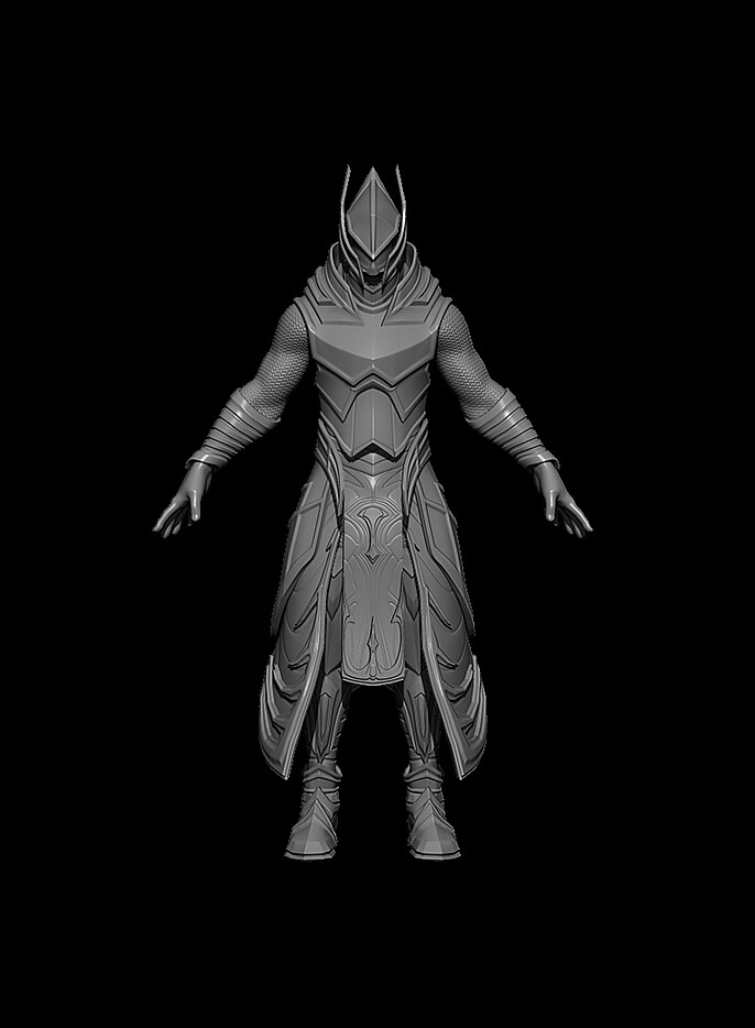
So I became aware of the competition just a few days before the actual deadline and hence didn’t have a lot to work with. I blocked out the initial sculpt design off the top of my head and used a couple of reference images for inspiration. The initial sculpt was done in ZBrush.
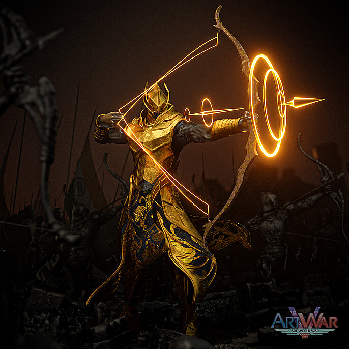
I wanted the character to be based on a hero in Hindu mythology, Arjuna. He only had one rival in the whole world when it came to archery and they were pitted against each other in one of the biggest wars mankind had ever seen.
The original idea I had was that he would be on a grand chariot pulled by horses like he is often depicted, but due to the time constraint, I chose to omit the chariot and instead had him fighting side by side with his companions on the ground.
I started off by creating a simple extract on the bash mesh which I wanted to be nanomesh chainmail, but to save some polygons I decided to use a chainmail texture instead of a low poly extract.
The entire initial sculpt was more or less low poly. I didn’t have the armor blocked out first or anything, went straight to using ZSphere topology to construct the initial shape and then used the zmodeler brush to refine it by adding thickness and creases.
In mythology, he had the ability to hit a target yards away blindfolded, so I thought it would be cool if his helmet covered his eyes too. The initial design also had shoulder pads, but in the end, I decided to omit them since they would probably restrict his mobility. I also had a bow roughed out in ZBrush but that was just to have an idea of the scale I wanted the bow to be, it wasn’t going to be the final version.
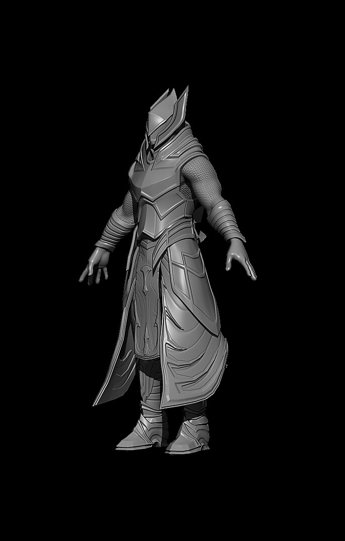
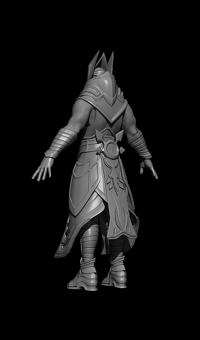
Since the whole model was more or less low poly and relatively clean already, I skipped the retopology step and jumped right to UVs in Blender 2.9. I tried a whole bunch of different armor textures including a dark silver metal, but ultimately I chose gold to make him stand out in the final composition (I started to rough out what I wanted the final composition to look like in my head and decided gold was the best way to go).
I used procedural texturing to make the armor along with the noise bump and the noise damage. There are multiple levels of noise at different scales to create the final gold texture.
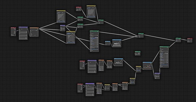
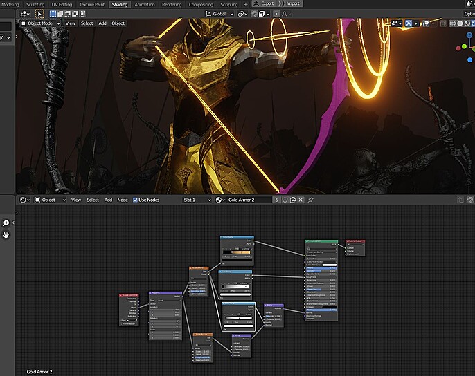
For the cloth, I used 2 different fabric textures, one for the bump detail and one for the color and design. And for the chainmail I used a chainmail texture, using the color information for the bump, and applied a procedural metal texture to it.

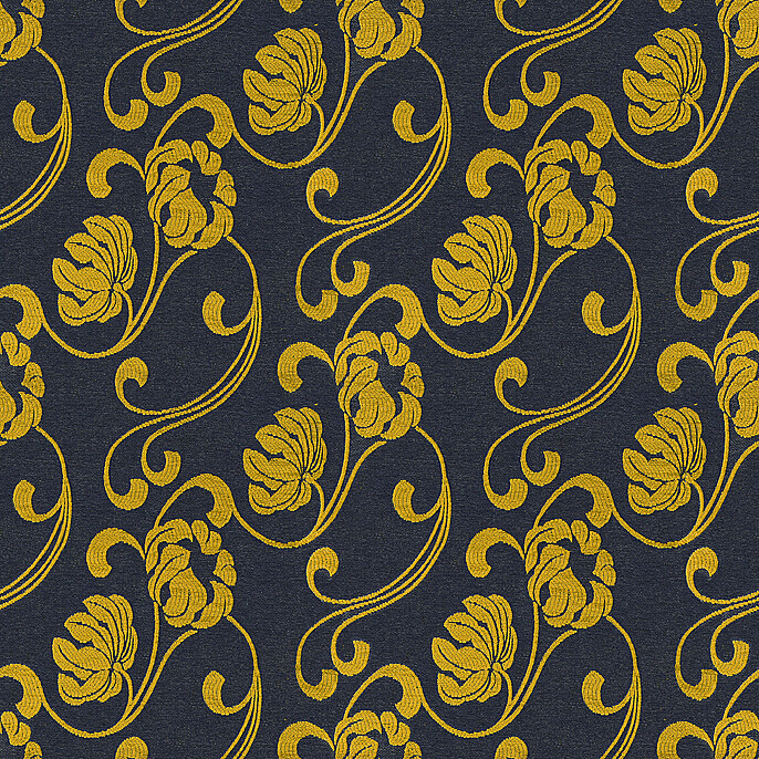
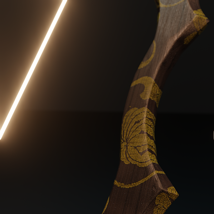
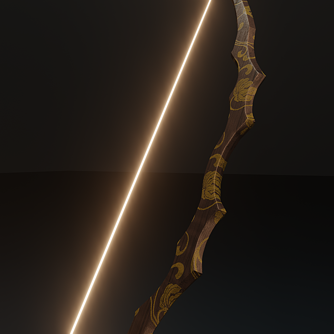
In the final bow design, I used a reference image and created a low poly sculpt over the image, and added thickness to it, refining the shape as I went along. I created a procedural wood texture, and then to tie the bow together with the character I overlaid wood with the same design that’s on his clothes. I masked out the dark colors so only the flower patterns would be visible, and added a different gold texture to the flowers on the bow.
I had the idea of also adding a little glow trim to the flowers, but when I tried it, but it looked a little over the top so I decided against it, although I did add the glowing string (inspired by the glowing string on the bow in that Henry Cavil movie I forgot the name of).
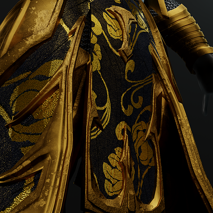
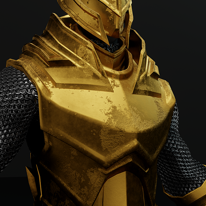
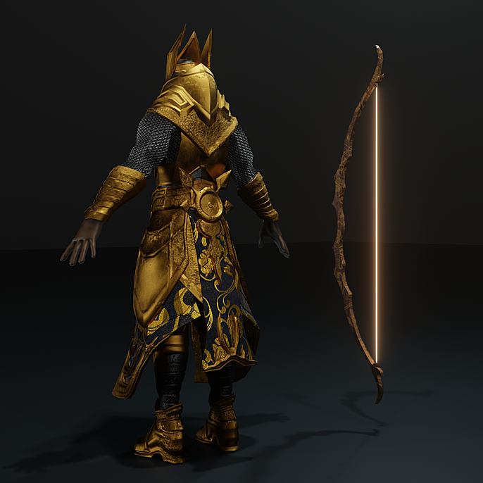
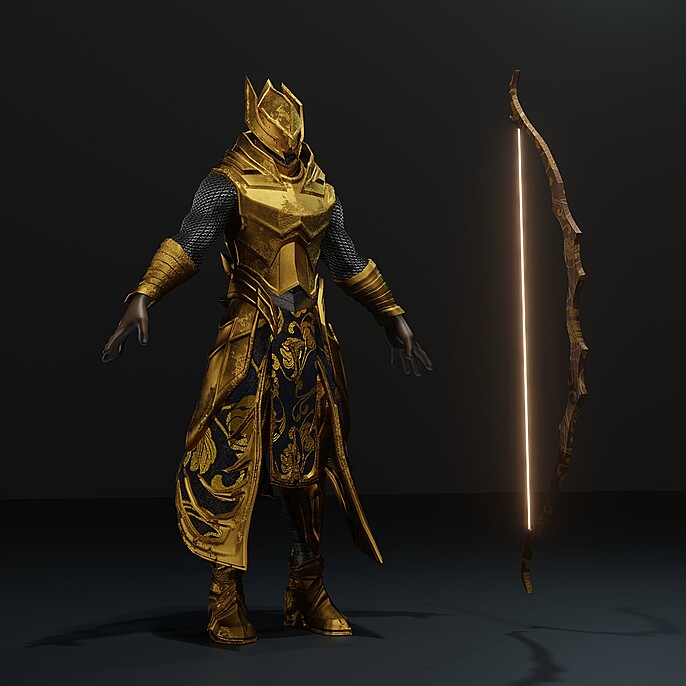
With the character and the bow completed, the next step was rigging. This would be my first time rigging a character so it was VERY challenging for me, and also where a lot of wasted time went. There’s a concept of vertex groups in Blender which I’m still not completely familiar with, and it was interfering with the way the character was being distorted (when I tried to pose the arm, the inside of his opposite leg would also be manipulated) and I had no idea how to fix it. I tried this for a total of 26 hours, even bought different rigging tutorials to try to figure out the problem, but none of them helped with the problem I was facing, so I posed him the old fashion way in ZBrush manually and reapplied all the textures to the newly posed character.
I did manage to rig the bow, however. The bow rig had an entirely different problem though. For some reason, when I pulled the string in the viewport it looked completely fine and as it should. When I hit “render” however, the string had a weird artifact, it looked like there were 2 strings being pulled. Why there was that difference from the viewport to the final render I was never able to figure out, but this was one problem I actively did NOT fix because I liked the way it looked, the ultimate happy accident :D.
With the character in position and the bow in place, all that was left was the arrow and the final scene construction. I had a few different ideas on how I wanted the arrow to look, but I was taking inspiration from a very particular arrow from hindu mythology.
This arrow was called the “Brahmastra”, and it was effectively a divine arrow given to Arjuna by his father, the god of thunder (Indra). This arrow was effectively a nuke, and on impact, it would do exactly what a nuke would do, total destruction leaving no one in the area alive, and the land would be uninhabitable for eons. So the natural course of action to take to make something look divine is to make it glow! :P
I went back into ZBrush and created a very simple design using cones and rings. I added the rings to make it look like they were helping him adjust his aim to his target. I imported the objects into Blender and added an emission with a layer weight to give the arrow its final look.
The final part was the scene construction for the final render. The whole reason Arjuna is famous in Hindu mythology is for the role he played in the great war, so I knew I wanted the final scene to depict a major battle. For the other soldiers, I used 2 assets I bought online and duplicated the hell out of them. One asset was an archer and the other a simple soldier holding a spear. They were simple and low poly, but they were perfect for what I wanted to set up.
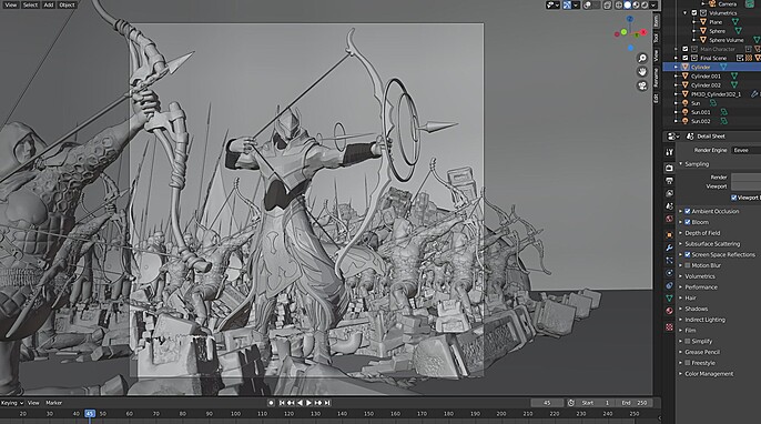
The first thing I did was elongate a few of the spears so I could attach a flag to them (as one of the competition rules dictated that there should either be a flag or it should be obvious where the character is from).
For the flag, I added a simple flat plane with the Indian flag texture on top, and then followed a Youtube tutorial to make it act like an actual flag using the cloth and collision constraints in Blender.
Once the flags were in place I set up the camera angle I wanted to work with and manipulated the flags as necessary. I then used exactly ONE small environment asset and duplicated, scaled, and transposed it strategically to make it look like a torn down castle. Because I wanted the main character to stand out, I added the same metal material to the archers, the soldiers, and the castle ruins to make it look like the army was turned to stone (such a thing was possible according to the mythology, but I just used that one tidbit to work in my favor for the final composition).
Now I had all the contrast I wanted to make the main character stand out, Arjuna was endowed in gold, and everything else was practically stone. But to make it pop I needed the optimal lighting set up. I had just finished watching the Snyder cut of the Justice League so I was heavily influenced by the cinematography from that for my final image.
I added two main lights, one spotlight from the top shining on the character, and a second area light from the front right (of the character) for some edge definition. I also added a faint backlight which would highlight his boots and show off a little more armor detail. Then I added some volumetric cubes over the whole area to create atmospheric interference and to hide a lot of the sharp background detail. I also added a few more scaled-up versions of the environment duplicates in the background to simulate a torn-down castle even more and added an orange light behind it to simulate a fire in the distance. I also tried adding depth of field by manipulating the lens features in Blender, but it wasn’t looking how I wanted so I decided to save that step for final compositing.
Once the whole scene was set up, I hit render and took the result into photoshop for the final compositing. I knew I wanted the image to look like a scene from a movie so I was working with that in mind. The very first thing I did was some brightness and contrast adjustments. After that, I duplicated the image and added gaussian blur, which I masked manually to simulate the depth of field look I wanted. The final tweek I added was the film grain, to make it look like it’s a scene from a movie. With some final tweaks of levels and grain strength, the final image was ready!
Follow Srikar here: