Berlian, The Mystic Shield
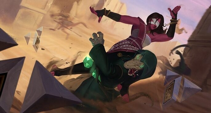
I’m Khalid M and I’m an illustrator/character concept artist based in Indonesia. I'm an aspiring artist hoping to break into the entertainment industry in illustration and concept design.
Here, I want to share with you the making of Art War 5: Berlian. My entry for the contest.
DESIGNING THE CHARACTER
Personally, when designing a character, I start by sketching them out for fun (I mean, draw them freely and sometimes it may look bad and that’s ok.) The purpose is to extract what we have inside our memory and visual library without external input, such as references. For this character, I have some keywords that I write when sketching it for the first time.
Keywords: Female, Fighter, Levitating, Shield, Blind, Eye Cover.

As you can see, those sketches look weird and really bad. At this stage, I don’t really think we should care about correctness. We need to find the core of our character. For this character, it took me a day to find what is her core. I’m not just sketching them, I’m thinking and imagining how she would interact with her world. Luckily, it’s a fantasy world and I can easily imagine a generic fantasy set up for her world.
After this stage, I tried to gather references. Since we need to incorporate the country’s flag and its culture, I choose what I know better, my country, Indonesia. These are my references for the character, they are from games that I like and culture from Indonesia ethnics (Batak, Gayo, and Nias). I also want to include a local martial art which is called ‘Silat’.
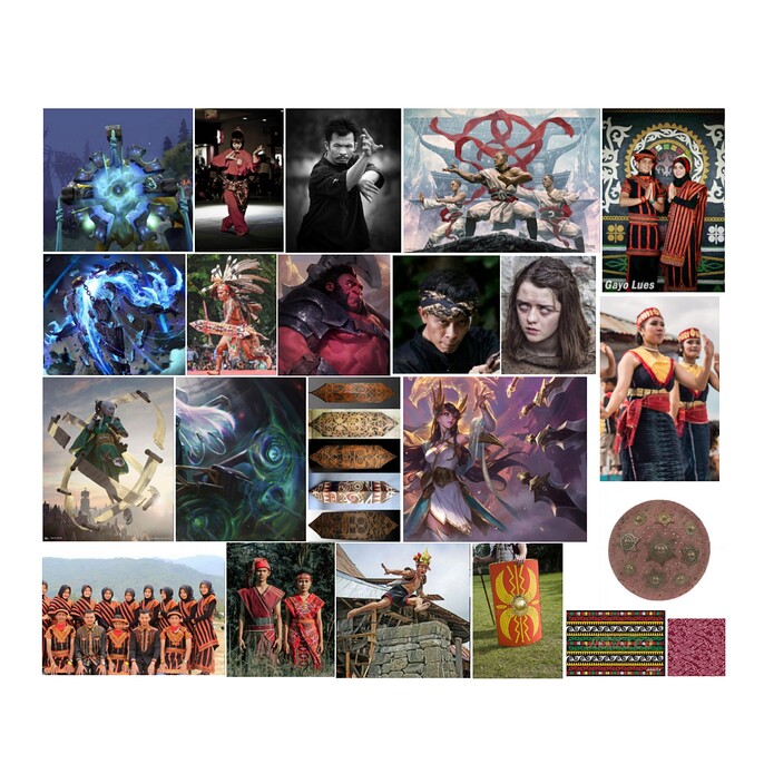
Based on those references, I came up with these sketches. They look much better than earlier (I’m not really confident with my lining skill though).
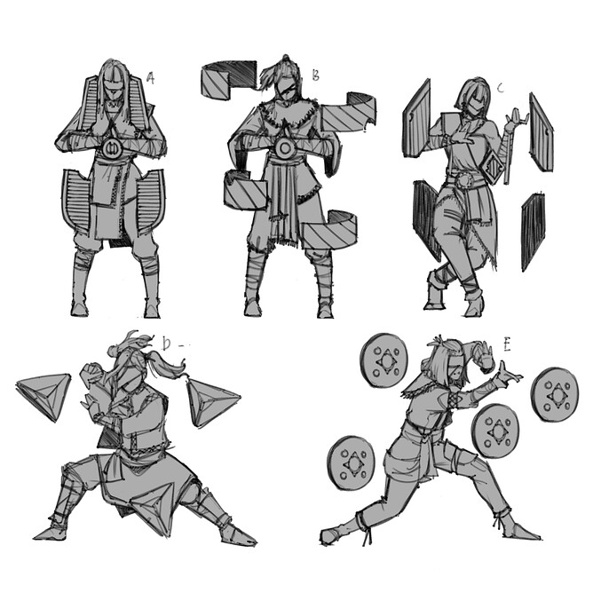
I also tried to create an animation on how she controls the shield.
Once I finished the sketches, I usually want to hear some feedback from people I know, so I asked my friends who do art and not for their impression of the character. I think having feedback from both sides will help you create likable characters for a bigger audience.
From this feedback, I got that most people love the ‘D’ character.
Next, we move to iterations. At this stage, I usually start with the costume. With references I gathered earlier, I create the variations that represent my vision for the character.
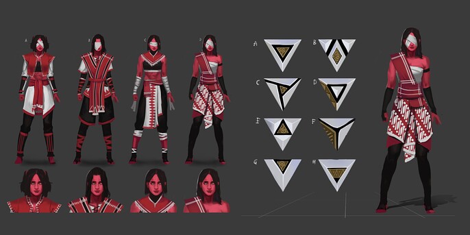
Once it finishes, it’s time to choose then start polishing the character and create a character sheet for her. For a character design, it is best if you use neutral/normal lighting as it will help show the details for the character.
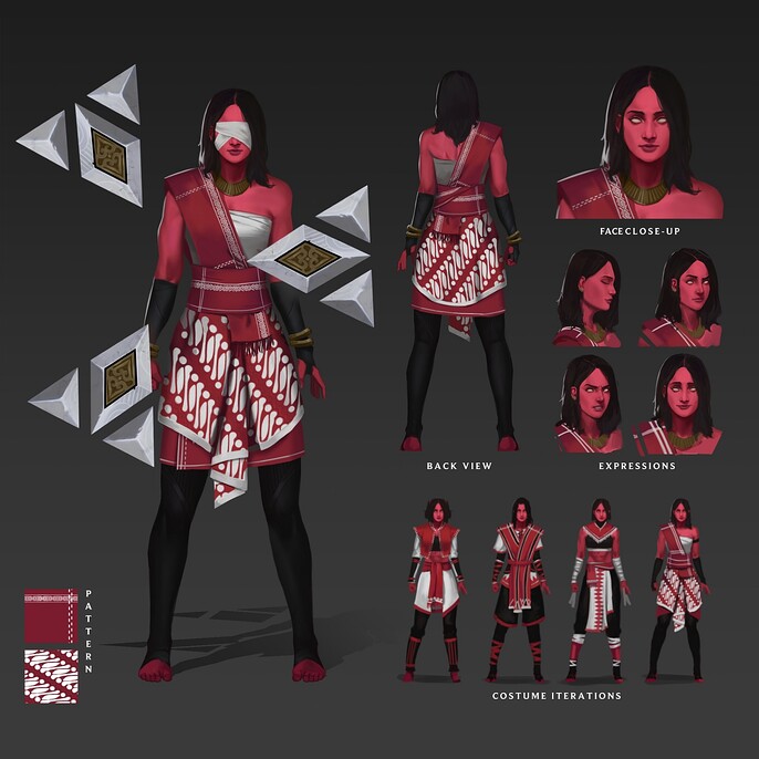
Random fact- Berlian means diamond in Bahasa Indonesia. I want her to be strong and precious just like a diamond.
PAINTING THE ILLUSTRATION
While writing this, I realized that I do so little planning for this illustration and this is where I think I make too many mistakes and end up changing a lot of things. So, please do better planning and gather most of the references that you need before starting.
OK. Let's go back to the illustration.
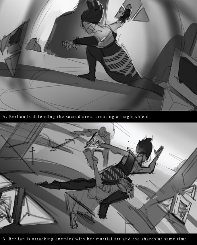
A typical workflow for a painting is to start with thumbnails. For this character, I create two thumbnails that represent attacking and defending. Personally, I think I can do well enough with ‘defending’ thumbnails, but I decided to challenge myself and picked the other one.
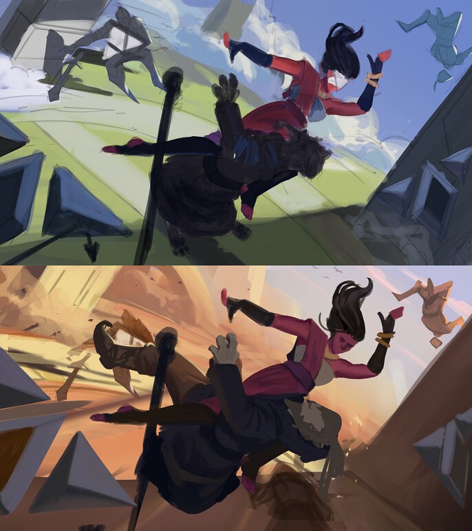
Now let’s do the colors composition. At first, I tried green and blue as the main colors for the illustration then realized that these colors look too calm and not invoking any aggression as I intended. Therefore, I created a new color composition that I like better than the previous one.
Now it’s time to render, before that I tried to fix a few things. Especially, changing the ‘enemy’ into lizard/croc. Since my character is in a shade, she will not be directly hit by the sun. Therefore the color looks a bit neutral with a small hint of reflected color from the sand.
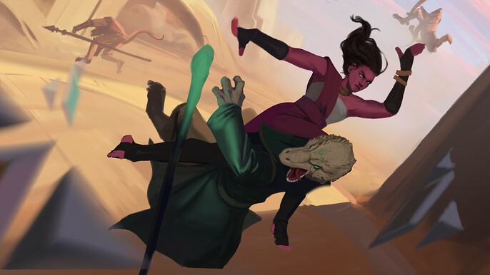
To create a good illustration, you should put more attention to the details and contrast.
Usually, it’s better to create more details in your focal point. In this type of illustration, the face and hands are what people are attracted to. So, we can put more details there. Arranged the details and rest area is also important. You can check Esben Lash’s video on youtube. I’ll put a link at the end of this article.
Since there’s nothing much to explain here. I thought it’s better to present it in a gif. Here is the process of rendering and tweaking.
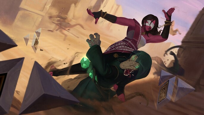
Finally, it finished!! I hope you can learn a thing or two from this short “the making of”. And lastly, let’s enjoy the final illustration.
Thank you very much for reading this. If you have more questions, please feel free to reach out on my social media.
Esben Lash’s Video :