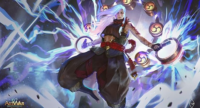
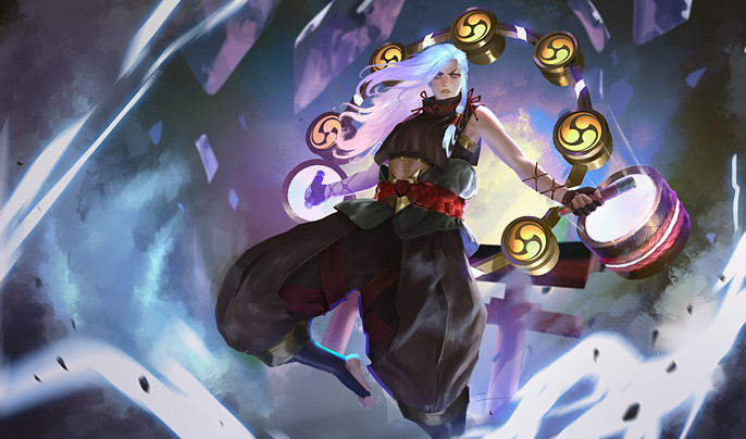
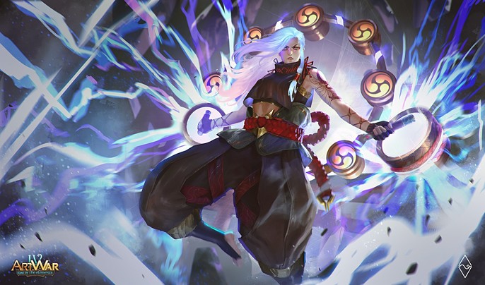
The Making of 2D Art War 4 Finalist: Kaminari
Fahmi Fauzi is from Indonesia. He is currently working as an Illustrator and Concept Artist at BumiLangit Studios while also making personal works between full time and freelancing.
Here, he takes us through the making of his Art War 4: Kaminari completed in Photoshop.
Gathering References
I think this phase is as much important as any other process of drawing. I spent about 1-3 days just researching what I wanted to show in my illustration including the look and feel of what the final Illustration will be. I took these images from Pinterest and Artstation.
In this illustration, I specifically want to present in Splashart style, so I took sample images from some well known SplashArtists like Bo Chen, Chengwei Pann, and Esben Lash R.
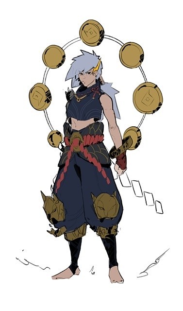
And after researching, I came up with a brief of how the character will look (with modification in the future process).
SKETCH
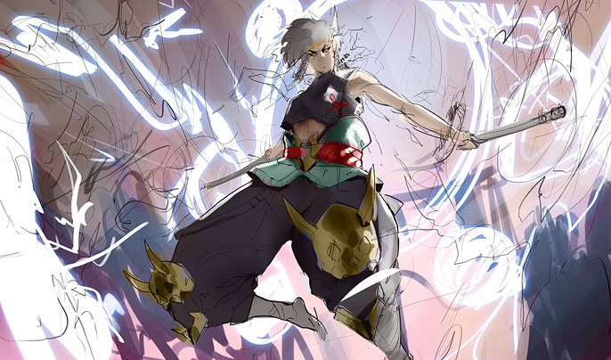
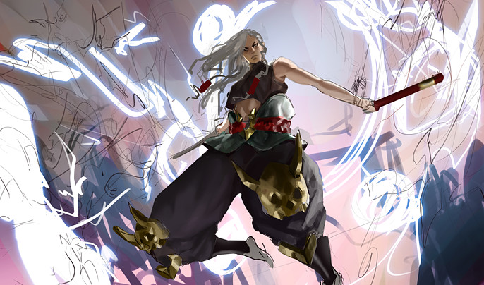
Based on a specific requirement of the contest the character must be in attacking or defense mode so I made two sketches of how her pose is. Eventually I chose the first sketch. (Also based on some feedback of some people).
In this phase I usually focus on the placement of white, grey, and black can be arranged to convey the idea I’m trying to visualize.
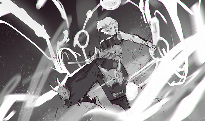
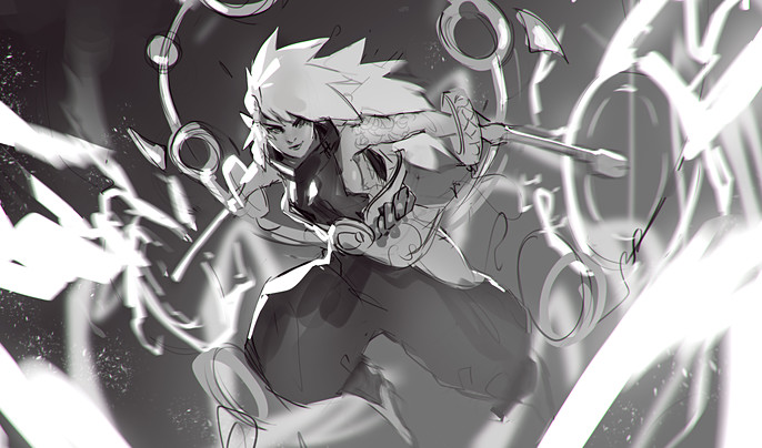
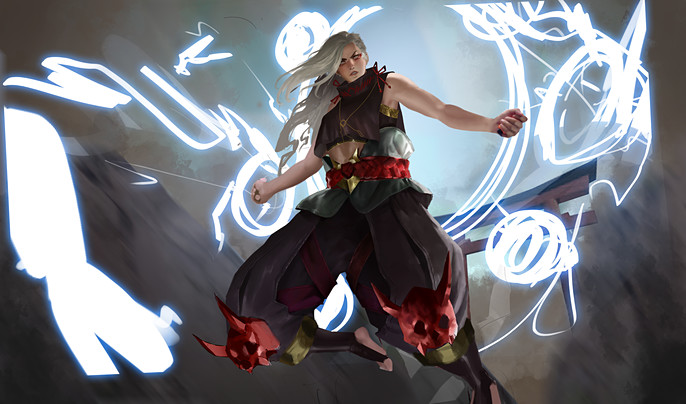
ROUGH COLORS
In this phase I just throw tons of colors that sparks joy! These colors can be changed later but to make it easier. I usually start with any colors that really pops up in my mind and try to “fill in the blank” the other color that might fit to the colors I have placed before. I might change most of the colors in the process but usually it doesn’t really far from what I have in mind initially.
I also do refining on some parts to define the light and shadow better while also removing some sketch lines.
Rendering
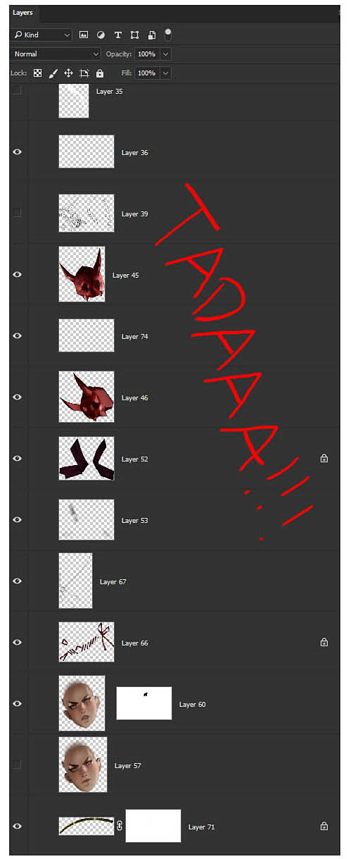
In this phase I separate everything into its own layer like belt, hands, even hair. This is intended to make my illustration is more organized. Since the rough color is pretty much defined where the light and shadow is so I can focus more on managing tiny little details.
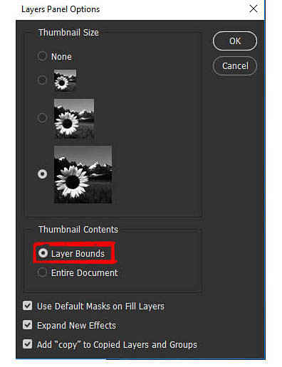
Since there will be a lot of layers, I usually change the layer panel options to “Layer Bounds” so I can easily identify which layers I’m looking for by looking at the layer thumbnails.
A mini-tutorial:
You can also put your pointer to specific part of the illustration and press CTRL + Right Click and click the layer name. I found it too confusing especially if you don’t renaming your layers each time you create new layers.
For this illustration I take a picture of my own hand holding a stick and place it in my own illustrations then repaint it to match the look and feel of overall illustration. By doing this, I can save up a good amount of time so I can focus on other task, rather than spending another 2-3 hours just to paint a hand from scratch.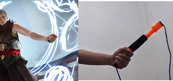
I change the hair color cause I think it would look much cooler if her hair is glowing while attacking.
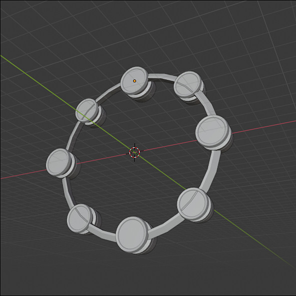
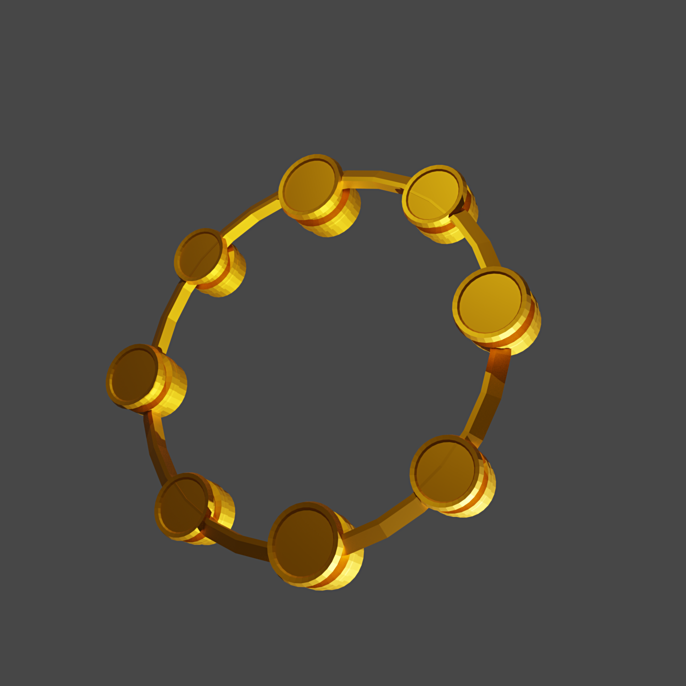
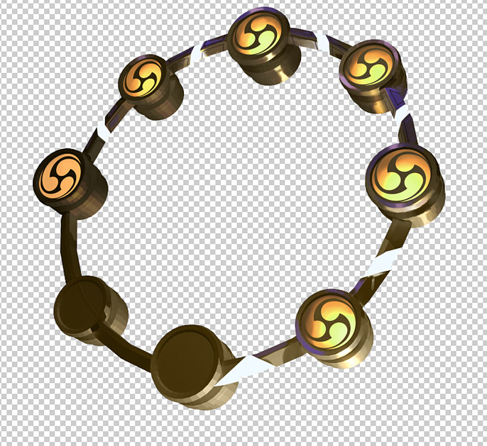
I realized that it can take another good amount of time to draw the ring/taiko on her back from scratch. So, instead, I use a little bit my knowledge of using 3D Modeling app (which is Blender) and render it to match the perspective and lighting of the illustration.
PUT EVERYTHING TOGETHER
As a final touch, I’m using Lineardodge Layer for lighting effect. I also add slight blue color as ambient color it add much more depth and volume on the character. To finalize, adding motion blur and dust/speckle can help the illustration to look dynamic
And that’s all! I hope you learn from this short step-by-step process thought.
See more of Fahmi's work here.