The Making of 2D Art War 4 Finalist: Camille
Leonardo Sala is an illustrator and concept artist based in Italy. He's currently working for a small indie company but someday hopes to work as a splash artist for games. Here, he takes us through his creation- Camille.
Starting the challenge I chose the electric element. My idea was to avoid the usual mythological - based character, so I decided to develop a sci-fi one, trying to implement the chosen element.
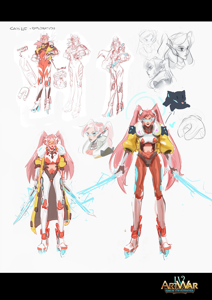
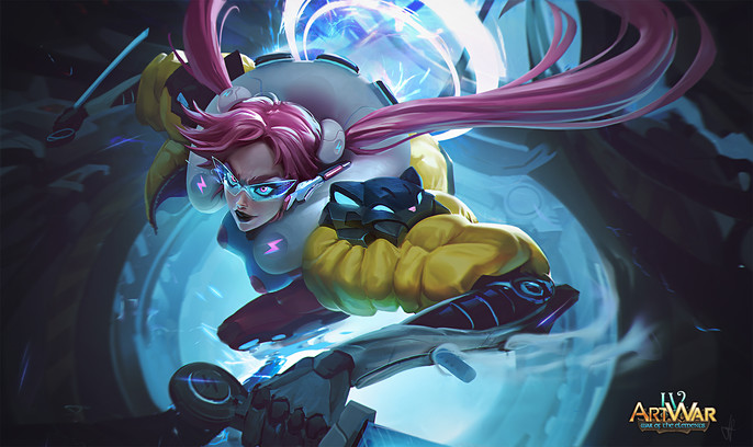
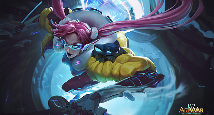
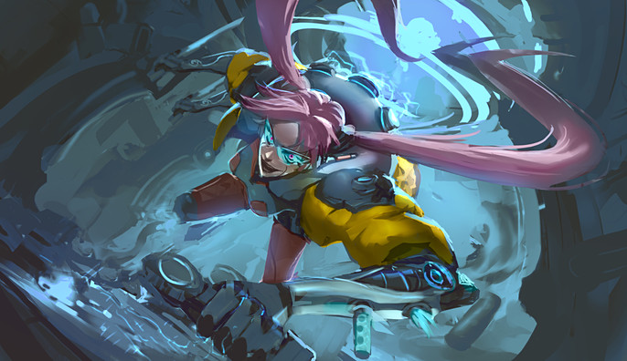
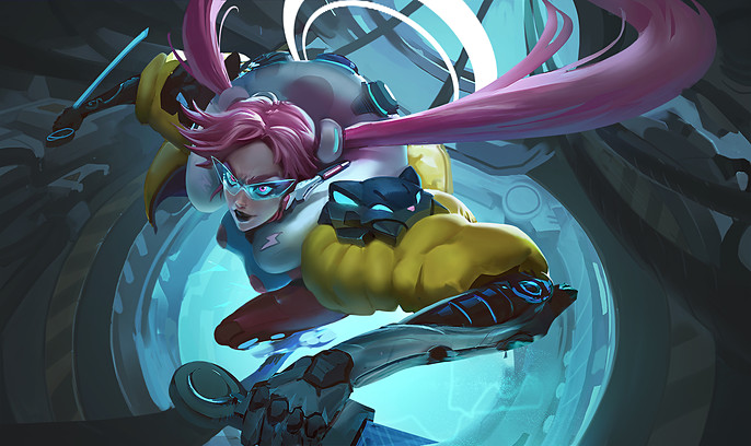
After some exploration sketches, I came up with Camille (fun fact: her name comes from the Hurricane Camille of 1969), an advanced cyborg, who is equipped to be able to capture the lightnings and carry their energy at will, in order to power her weapon and her central core.
I wanted my character to be fast and powerful, but at the same time to have a nice and light appeal, so I used angular shapes as opposed to soft ones. In this way, round and soft shapes of the jacket and the backpack create a nice contrast. I gave her two nice long pigtails, thinking how they would move with her during a fight, with
nice and dynamic shapes that twists like a hurricane.
She also had to be fast, so I decided to give her a cool pair of electric rollerblades.
I was not sure about the shoulder pad design, but it ended up to be a cat look alike, to give her that "unique accent" to the simple design.
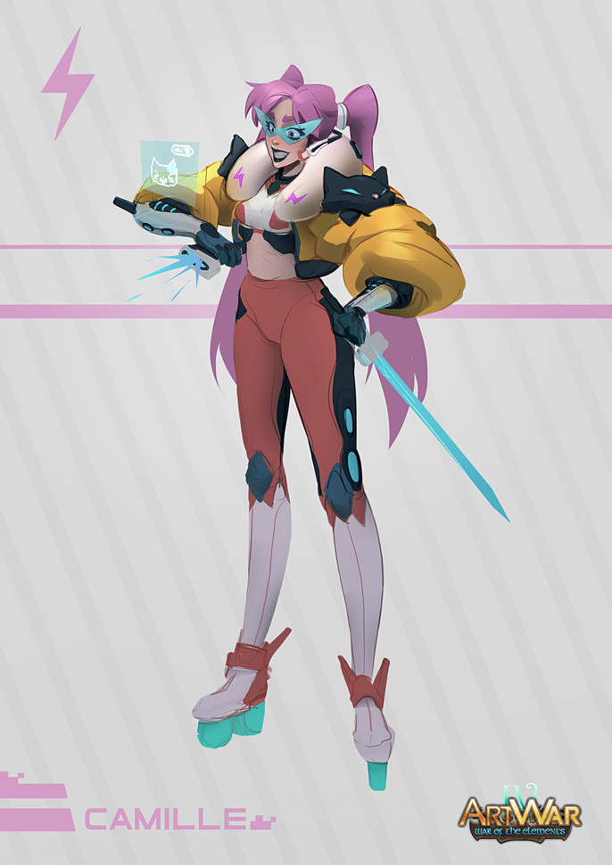
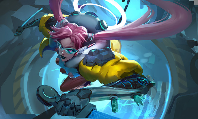
Final Design
In this case, for me the real challenge was to find some free time to enjoy this piece in-between works, so I had to made some choices to fasten the process, in order to focus on the splash as soon as possible.
You should take your time and always find the best choice you can to develop your ideas.
Let's jump into the splash!
Before I started , I did a quick research in order to gather some references that could be helpful during the process, furthermore I watched some other artists works to feed my mind and "setting the bar" for the kind of work I wanted to do.
Remember guys, even though you may think to know something, you can't be able to know everything perfectly, and it's always useful to compare your works to the ones that represents the level you want to reach.
Therefore , use references and be honest to yourself!
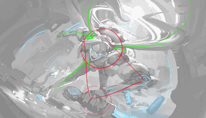
For this kind of splash, it came natural to me to go for a dynamic composition.
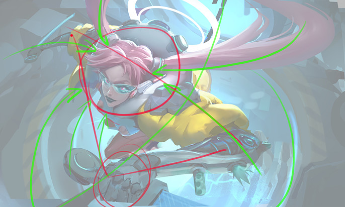
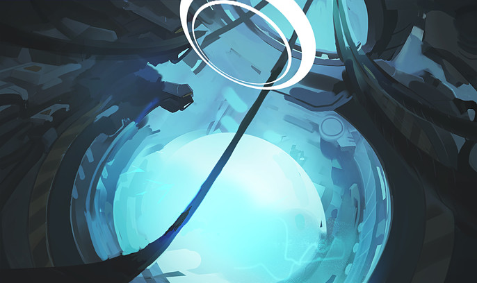
The general idea I wanted to represent was Camille escaping from a laboratory after a power overload during a storm. In the next phase, I realized that the laboratory environment could help the character in terms of composition, so I thought that during the escape Camille could grind one of the high voltage cable through the laboratory, that works as a good line of action for the whole image.
Firstly, a solid triangle shape leads the eye to the focus, which is enlightened with a circle. Secondly, secondary elements give strength to the focus. Finally, the dark silhouette isolates my character in contrast with light bkg, setting a clear values hierarchy.
Thinking about light as a tool for your composition is very useful.
Colors
In this case I wanted to create a nice contrast with the yellow of the jacket and the light blue of the electricity, so these are the colors on which I based my palette. Studying color theory and analyzing other artists works will definitely help you to make accurate choices during your process.
Coloring your thumbnails could be tricky at first, so pay attention!
I generally lay down colors with blending modes at first (like overlay, hard light, color dodge, multiply and color), but if you don't pay attention, you will messing up all of your values and color temperature, and your image will look muddy, even though the base values are correct.
For this reason, I used blending modes only as a "trigger" to start working on a normal layer, painting over the base I created at this point. There are so many ways you can approach this phase, so experiment a lot and find the one that works better for your brain! Many people are good in working with blending modes, others feel more comfortable working directly in colors, I think that my initial approach is in the middle and it helps me to focus one thing at a time.
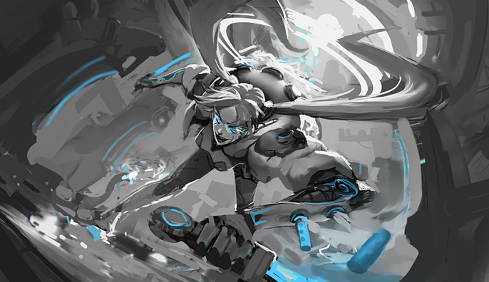
Once my base is done, I started cleaning up the entire image one thing at a time.
I checked out anatomy, gesture, composition, lighting and values, until everything is settled down and is ready to be rendered. Everything is still rough now, so it's easy for me to make big and small changes without losing too much time.
I continuously zoomed out the image to check the whole work from the distance, until I could see the final splash in the thumbnail. I'm not the kind of guy who loves layers and technical stuff, so in this stage I like to work freely, in order to feel more natural and not to break my workflow. I like to focus on polishing when everything is settled down.
Now I can start rendering.
Work From General to Particular
This is a fundamental rule to follow for me, especially when I work on such big and detailed illustrations like splashes.
If everything is detailed, nothing seems detailed, so you have to think about what you want to really stand out and push the detail at its best only in that area.
Think about a drop falling into water and the circles it creates, those circles will disappear progressively. Well, the drop falls into your focal point, and the detail progressively fades out from that point.
Keep rendering, enjoy the flow, relax.
I feel like rendering phase is a kind of meditation, because everything is still there, you just have to push it and treating everything in its particular. Pay attention to the lighting and how each material reacts with its properties.
Work always from general to particular, as I already said.
In a good deadline condition, it's useful to do small focused studies for the materials you feel weak at rendering. Play with contrasts and pay attention to make each material recognizable, searching for design even in the texture of them (for example: bomber jacket material vs shiny hard surface part vs matte backpack, matte skin vs shiny crisp glowy glasses.)
Packing Everything Up
In the last phase, I did some post processing, because everything need to be in harmony at the end. I pushed hard surface parts like glasses, bionic arms and shoulder pads with sharpening layers, and blur out of focus stuff using a bit of motion blur combined with gaussian blur.
With lighten layer and curves, I homogenized the darks and push some enlightened areas with color dodge. I also used color dodge and experimented with a bit of textures to add that juicy plasma effects behind the character.
Finally, I added some noise and a little bit of vignette in order to pack up everything.
That's all folks!
Final