The Making of 2D Art War 4 Finalist: Guardian’s Rest
Riz Vates is a 2D generalist working as lead in a local video game outsource company. He takes us through his creation Guardian's Rest.
For starters - illustration isn’t my primary field and Art War is great opportunity to work with real time and theme restrictions. For me, Art War is good testing playground for my skills. You definitely should jump in as many challenges and contests out there in the wild as you can (and want, of course). It will help you to grow, for real.
Shaping a Champion
First things first, this time I was blessed with good working idea from the start and all I needed to do was to pull it out and clear the unnecessary rubbish. But don’t be too hard on yourself if you haven’t found one quickly enough - ideas are cheap. Pick whatever you think will work for the situation you’re in.
Considering my previous experience with Art War 2 I’ve decided to shift my priorities. Last time, I spent too much time on the concept and that's it, there was no room for the illustration.
This time, I decided to spend time on the concept as little as possible to make it good enough and go further. And, in general, “good enough” is great mindset to follow, especially if you are not so experienced and have defined time restrictions (note: in situation where concept isn’t a final product).
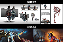
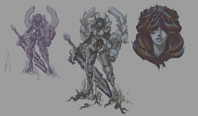
My focus was to make it in time and somewhat competitive. So, here is few of mine first iterations for the Champion:

My idea for the champion was based on restrictions given. Rocks, some roots, pointy thorns maybe. I can draw it relatively fast, let's roll with it. Aims were to grasp stone-cold elegance and natural power of the Earth in the form of statue entangled with thorny roots to make her move and smash.
I wasn’t too fancy with variety and kinda okay with initial direction. So, just continue to define shapes, details and concept overall:
From this point I was ready to jump into composing an illustration.
Staging a Scene
For this part, references are your best friend, but more on that later. First what I’ve done is established overall narrative of the scene and tried to capture it in general view. Another handy thing about it - with this general view I was able to estimate camera angles to capture my champion in most efficient frame:
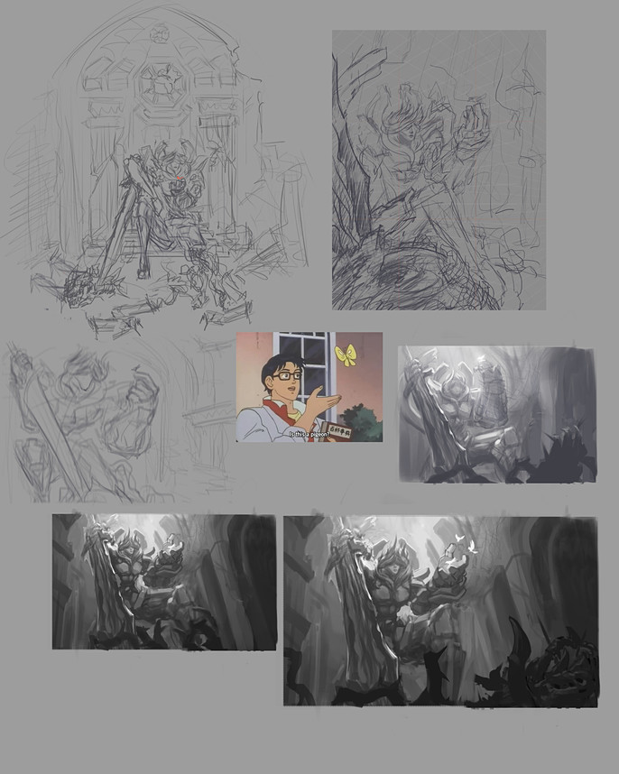
With narrative in mind I’ve tried several shots of the scene and come to conclusion - this is not working as I want it to.
So here is time to pick up some references. I’ve picked few juicy splash pieces to analyze what makes them so good and tried to recreate this feeling with my idea and narrative.
Frame after frame I’ve came to one that I can continue to work with.
In the process I figured I should chop a lot of narrative bits from the picture, leaving the most relevant. Don’t hesitate to sacrifice some details for the sake of the integrity of the illustration.
Next step is general value breakdown and separation of planes. Keep in mind future focal point of contrast.
After that it’s time to move character from concept to scene. For this piece I prefer to work with line first to clearly translate shapes and details of the character:
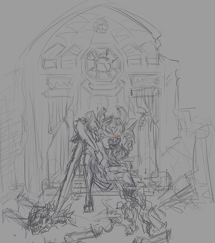
I’ve tried to focus details in the portrait zone to establish focal point of the entire picture.
Color and Mood
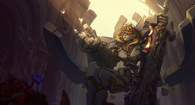
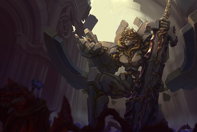
Now I can move to the finish line of rendering the whole thing.
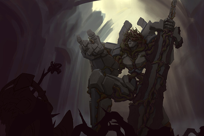
I’ve started with darker values and moody colors to establish atmospheric lighting inside of the environment to make the focal point pop even more when I add direct light source.
Another important thing on this step - to define the edges of the shapes and establish internal and main gradients. From now on, it is important to check your values frequently.
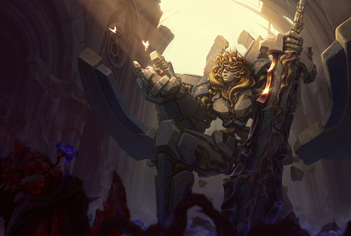
Oh, this is was kinda funny (not), I forgot about the whole damn “wings” thing and I spent an evening trying to squeeze them into the established composition.
Later, somehow I managed to make it work, so it’s time to turn on the light:
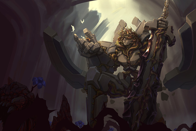
From here I can move to defining the environment and overall polishing. Add some texture and more juicy colors.
Everything left is post processing to its final form.
Last bits were to clearly separate focal point from the rest of the picture, double check the contrast and add more atmosphere to the illustration.
Final piece of advice is to place together your illustration with your references and look at what is missing to make yourself proud.
Follow Riz on Instagram.