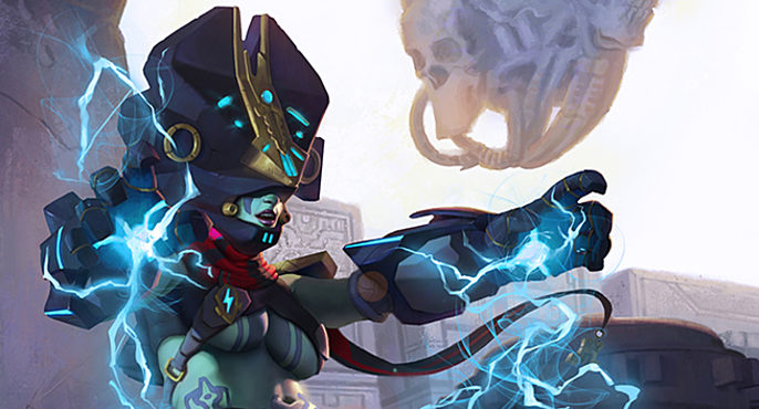
The Making of 2D Art War 4 Finalist: Keeper of Thunders
Rob Zepeda has a Bachelor's degree in graphic design from Universidad Intercontinental (Mexico City). In 2005 he graduated from college with the thesis "Science Fiction and Fantasy Illustration applied to a Roll Game".
He became very passionate with fantasy art, taking his earliest influences from artists like: Frank Frazetta, Boris Vallejo, H.R. Giger, Brom among others.
Derived from this interest for drawing and painting, he studied art fundamentals and different techniques that involve both traditional and digital media. His love for digital media lead him to integrate 3D tools to my artistic approach and has allowed him to be continuously evolving and searching for the latest art techniques.
On October 2019 he presented his artwork in the showcase that took place at Iluxcon XII.
Since then, he's been reaching out game publishers and studios with the objective to fully enter the professional illustration industry with a focused interest in trading card games and concept design for video games and films.
Here, he takes us through his creation of Keeper of Thunders.
Part 1 Character Design
Race: Enhanced human
Gender: Female
Body Constitution: plus size or curvy
Element: Lightning
Universe: Cyber Prehispunk (hi-tech sci fi with prehispanic glimpses)
Fixed Characteristics
- Soldier
- Elite
- Badass
- Imposing
- Sexy
- Aggressive
Ideas/Concepts
- Crazy
- Dangerous
- Brave
- High class warrior
- Strong
- Foxy/hot
- Heavy
Visual elements/Shape Language
- Geometric
- Flat
- Sexy clothing
- Angular/sharp
- Bulky
- Aztec motifs and ornaments:
- Feathers /Quetzalcoatl engraving/eagle/ other Aztec symbols
- Bones/skulls
- Pre-hispanic jewels
- Spirals
- Not over-detailed parts
- Saturated colors accents
- Dark Metal
- Gold
- Plexiglass or plastic ??
Reference Board
- High-tech Soldier
- Angular Armors (not very rounded)
- Stylized Realistic/Realistic
- Pre-hispanic cloths/jewelry/weapons/tattoos
- Pre-hispanic sculptures
- Mecha Suits
- High tech Canon
Resumed Version
Elite, curvy, badass Sci-fi soldier.
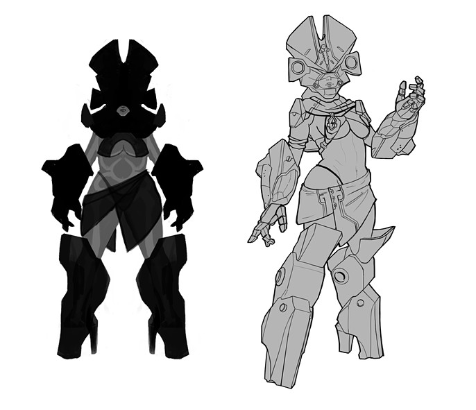
1.2 Silhouettes
I started with a gray body that had the basic proportions and body constitution of my main character, after this I was able to try different silhouette designs for the armor and general look.
At this point, I was only concerned with the major shapes, not medium or small details, just the foundations for her design.
An amazing tool for this step was “Alchemy”, an open source (free) drawing tool that produces more abstract results than drawing in Photoshop. This software has been built up to take a little of control from the hand of the artist and let happy accidents to appear on the canvas.
Later I used Photoshop to tweak some aspects of this shapes, the result were 10 different designs.
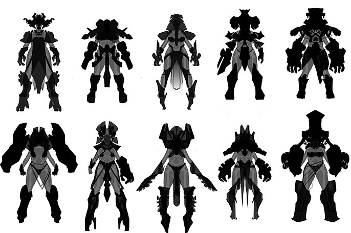
From my first batch I chose 3 sketches A, B and C, I found them to be the most appealing for their shapes and they covered aspects mentioned in the brief.
Some variations were made to obtain the 3 final designs (A2, B2 and C2)
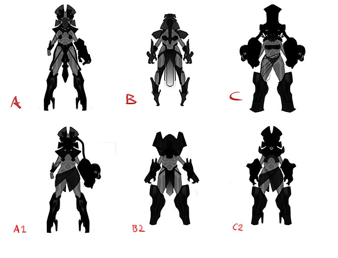
And the winner is... C2.
I loved the idea of a helmet that looks like a headdress or crown, this supported 2 important aspects:
a) The intention of a character that belongs to an elite status.
b) Aztecs and other pre-hispanic cultures used headdresses as important part of their garments, the more important the person, the more beautiful the headdress should be.
I hid an Easter egg with the shape of the helmet, later I will discuss more about this.
From sketch C I took the big and bulky gloves or gauntlets, from the beginning I imagined that this guardian should use her hands as weapons that produced massive amounts of electricity.
The structure of the boots is meant to continue with this idea of strength. The high heel in this “mecha” boots and the clothing are intended to remind us that she is a super sexy and badass woman.
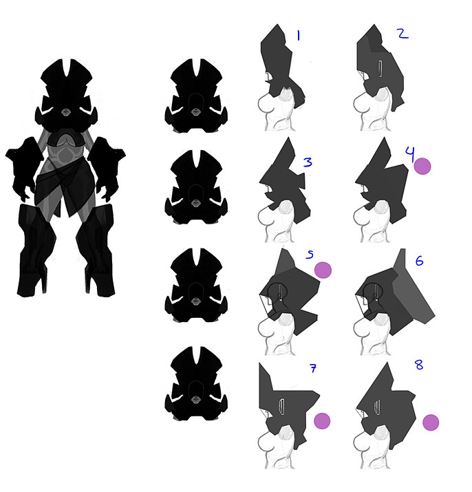
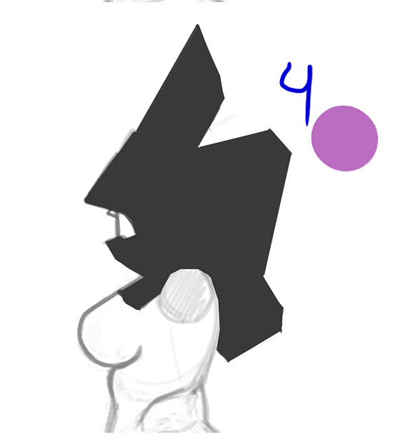
Because the helmet is a very important element in the character and I wanted to get a 3D model, I designed some variations of its profile. The ones with a pink dot were the finalists.
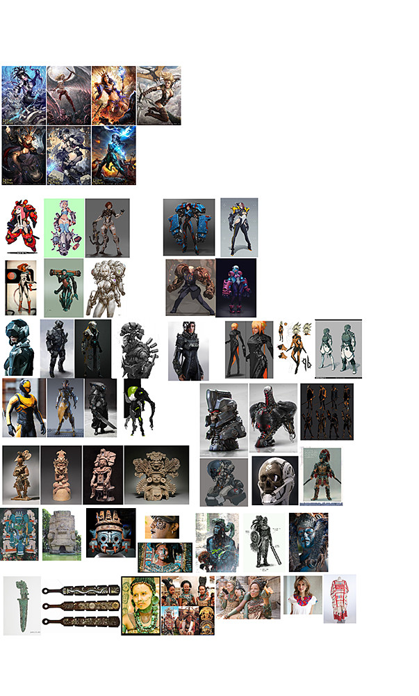
1.3 Moodboard
I gathered a lot of images that gave me very important information, about:
- Proportions
- Material
- Shapes
- Colors
I recommend Pure reference, another open source program to gather images and build moodboards.
My idea for the illustration was to use a portrait format to focus the importance of the image in the character, the game Legends of the Cryptids was my main inspiration.
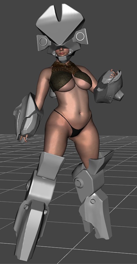
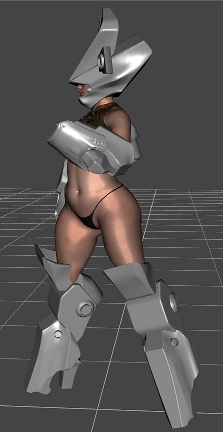
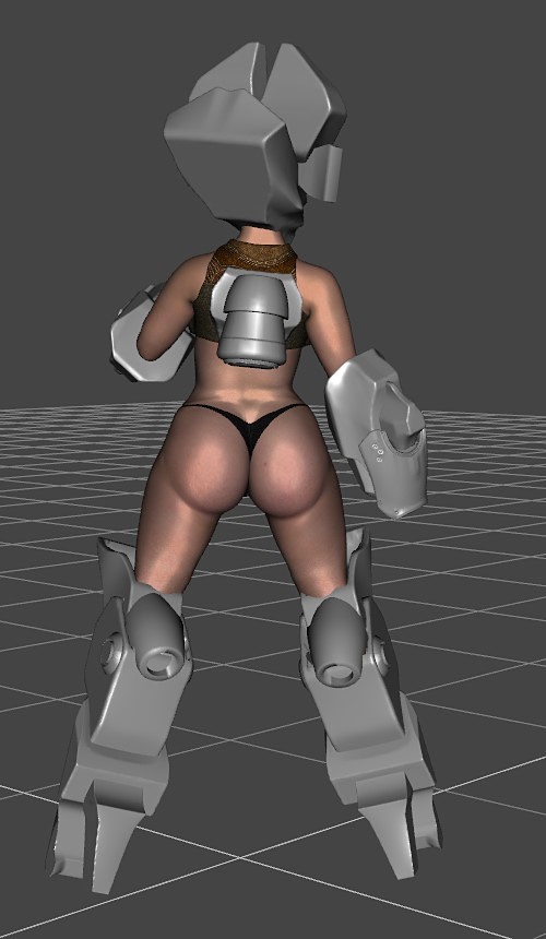
1.4 The 3D model
Because the armor was going to have complex volumes I decided to build a 3d reference in order to handle in a more efficient way matters like perspective and lighting; textures, clothes and detailing would be addressed in the painting phase.
For the girl I took a Daz 3d model and modified her body in order to fit my idea, for the armor pieces I used Blender 2.8 to model basic 3d volumes.
The helmet profile I chose was No. 4 but I had to tweak some things in the 3d model in order to obtain a more functional piece
Because the hands are a very changing element of human figure I decided to model them after the final pose for the illustration was stablished.
1.5 Character Design
Medium, small shapes and details were added to the armor design directly in Photoshop.
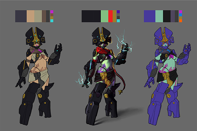
1.6 Color Variations
The idea of a skin tone with greens and blues came while I was watching my moodboard, we can see how pre-hispanic art, sculpture and painting, depicted some characters with a greenish tone of skin.
I loved the idea of a person with an abnormal skin tone, this element can tell us that this elite soldiers are not regular people, they may be enhanced versions of humans with super abilities that allow them to be guardians of the elements in nature.
Final Design
Time to talk about the Easter egg I mentioned before.
On the next image we have a real Aztec sculpture of Tlaloc, the god of rain and thunders; I took some elements of this representation and place them in the helmet and face of my character, I didn’t want to be very literal so I hid them.
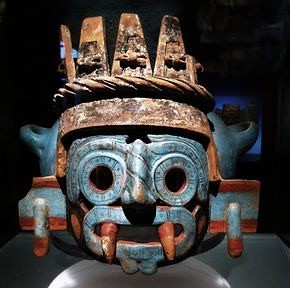
- Ear ornaments- We can see squared shapes at the height of the ear that adds some interest to the silhouette. In my design I modified a little bit this squares and intersected them with the main helmet.
- Rings as eyes- The sculpture shows the eyes of this god as two rings which I integrated inside the “earrings” as gold pieces.
- Fangs- Two conic fangs are protruding from the mouth, in the face of the girl they can be found as tattoos at each side of the nose and mouth.
Part 2 The illustration
2.1 Thumbnails
My goal was to depict a scene where my character had to protect the temple of Tlaloc from some intruders.
I used my 3D character to get 3 different poses and tried different camera angles, just by using 4 values of light I could see which compositions offered me an interesting look and mood. This gave me 18 compositions so I chose my favorite 6.
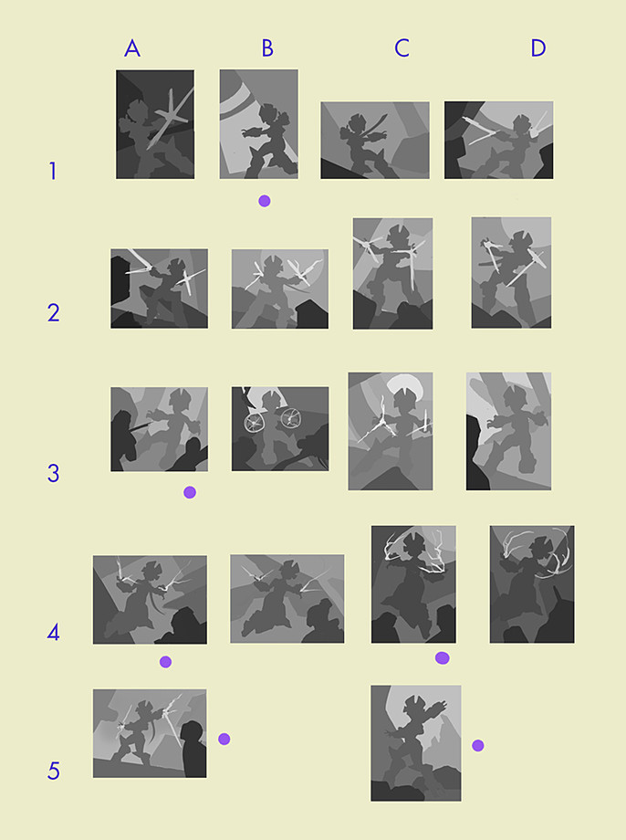
Note: Sketches from row No. 4 were cool but at the end I thought the pose was very: Storm from the x-men. I didn’t want to fall into the levitating girl cliché, maybe I’ll use that for other thing.
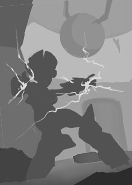
2.2 Final Composition
I mixed composition 1B with 5C and modified some elements to show glimpses of the temple.
The reason I chose this was because the pose of the character ,combined with the tilted camera angle, gave me a sense of lack of balance derived from the recent attack.
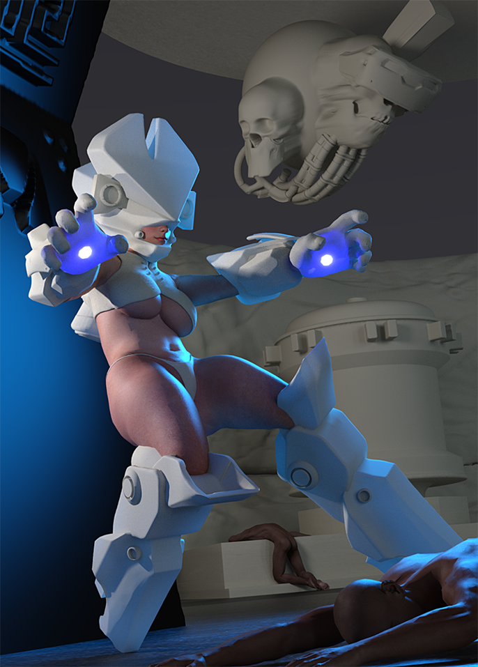
2.3 Building the 3D Reference
Again Daz 3D and Blender 2.8 were key tools to compose this final reference. Thanks to this render I had enough information about perspective and the behavior of lights.
Note that the hands are just an inflated (scaled) version of the female model, you can still see fingernails; obviously in my line drawing I had to modify the shape of the fingers in order to have a less organic feel.
For the fallen intruders again Daz models were very useful.
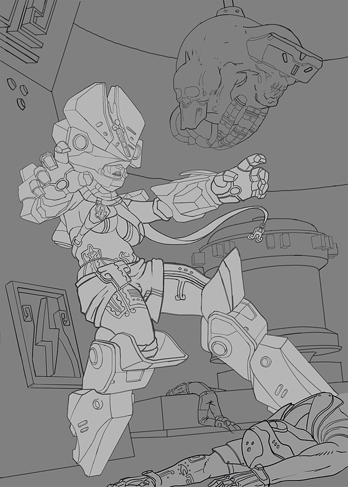
2.4 Final Line Drawing
I traced over the 3d render and added new elements and details.
Note for the reader: Tracing over 3d renders is a super helpful strategy that can save you hours of work but please remember that a 3D render is not free of mistakes.
It’s very important to apply your knowledge of human figure drawing and use it to modify things that aren’t working.
Take render’s useful information and enhance with your knowledge the things that need some tweaking. ALWAYS DRAW DRAW and DRAW.
I wanted to give a lot of importance to the face of the character so the composition is arranged in a way that our eyes want to return there.
You have to keep the view and attention of the public the most possible time, be careful with lines, values, colors or other elements that can lead the eyes out of the image.
You want to guide the viewer’s sight to a determined focal point inside the plane.
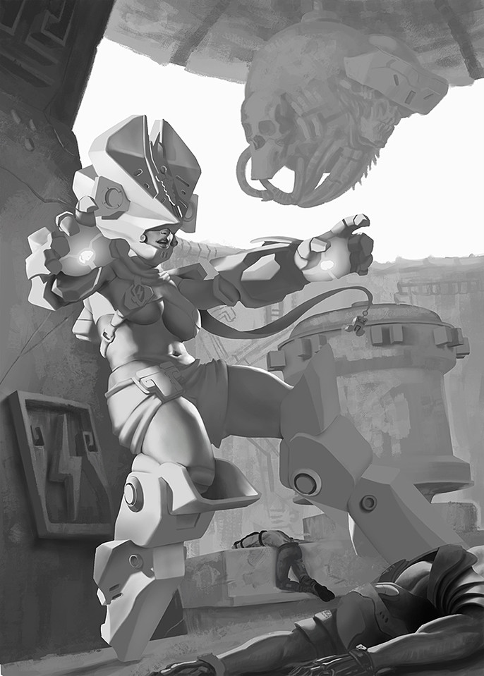
2.5 Values of Light
I wanted to establish a very solid foundation of light values in order to see what things were working and what things were not.
It’s totally ok if you want to tackle color directly but remember that with color you will have to juggle 3 balls at the same time: hue, value and saturation.
I decided to first juggle one ball (value) and then, in another step, hue and saturation.
If your values are right I’d say you have more chance of success.
Another important thing that gives great punch to an image is ambient occlusion.
This phenomenon occurs when two or more surfaces are in contact and the rays of light can’t reach this areas, example: contact area of the nose and helmet, contact of the breasts with the torso, etc.
Super-duper important at this point are edges. You have to decide if a shadows has a hard, a soft, blended or lost edge. The correct use of edges adds a lot of realism to an image, a lack of knowledge in this area produces images that look dirty and smudgy.
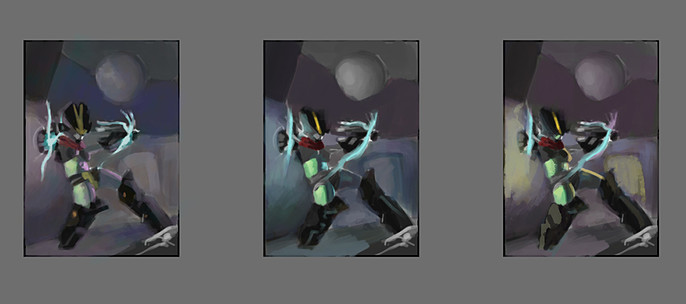
2.6 Color
Before applying color to the final piece is very helpful to have some quick color sketches.
I did 3 very rough and shitty to establish a general mood, at the end I used the first with the warm rim light of the third.
Now that you’ve stablished a color palette you can start applying flat colors depending on each material.
I find very useful to save my selections by materials in case I want to work only in a masked area and revisit that part later on, example: skin, gold, red cloth etc.
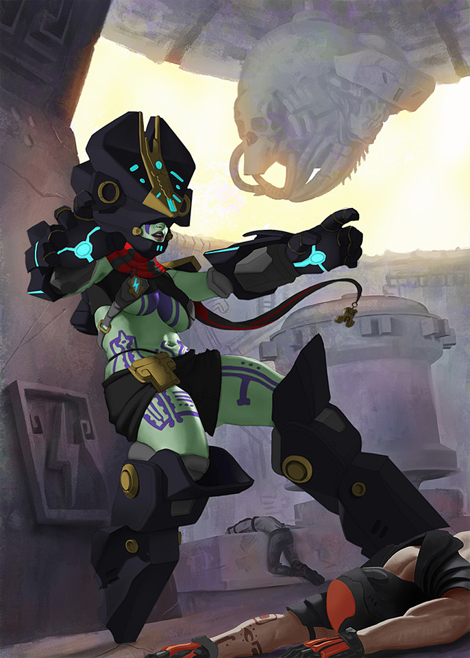
2.7 Rendering (Color Variations)
With the general colors on the canvas, it’s time to make them interact and play.
This part is very complex and time consuming, at least for me, because you have to think and analyze how light is hitting and bouncing from object to object.
You have to take in account the temperature of light, source, intensity and how this affects different materials.
Some materials will be more shinny or glossy than others; at this point it’s very important to have good references, you can find lots of them on the internet or make your own, just take your mobile, look for the right lighting conditions and shoot.
Another tip I can give is to solve first the background and the elements that surround the main character, you’ll have more information about which color are affecting some areas.
When applying different colors It’s very important to respect value structure, always refer back to your value study.
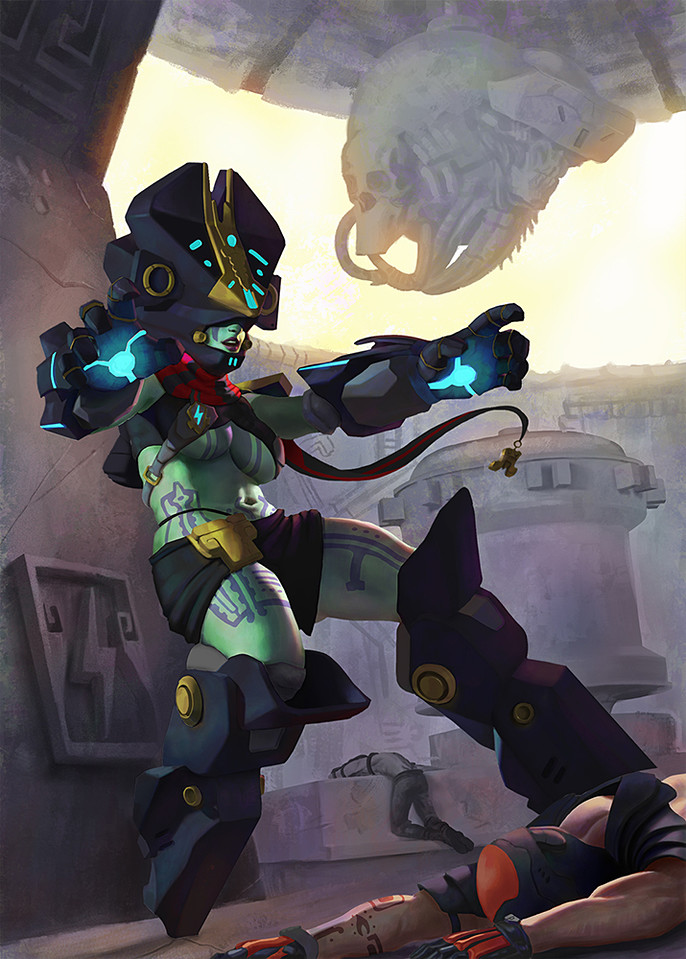
2.8 Detailing and More Rendering
I continued working with color variations and adding details until I felt good with the image.
Again, when applying opaque color details over the grayscale image remember to use different types of edges depending on the circumstances.
As you can see I decided that the light coming from the left side (camera’s side) would be blueish and cooler, while the rim light hitting the right side of her would be warmer with yellow and pink tones.
The background and secondary elements were detailed more, I had to modify the wall from the back because I wasn’t happy with it the way it looked.
Just close to the end I added the bolts of lightning and I took care of not guiding the eye out of the image.
Remember COMPOSITION is more important than pretty brushstrokes.
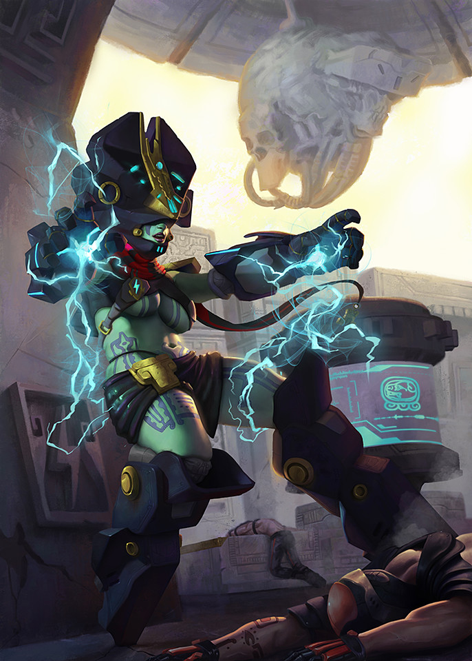
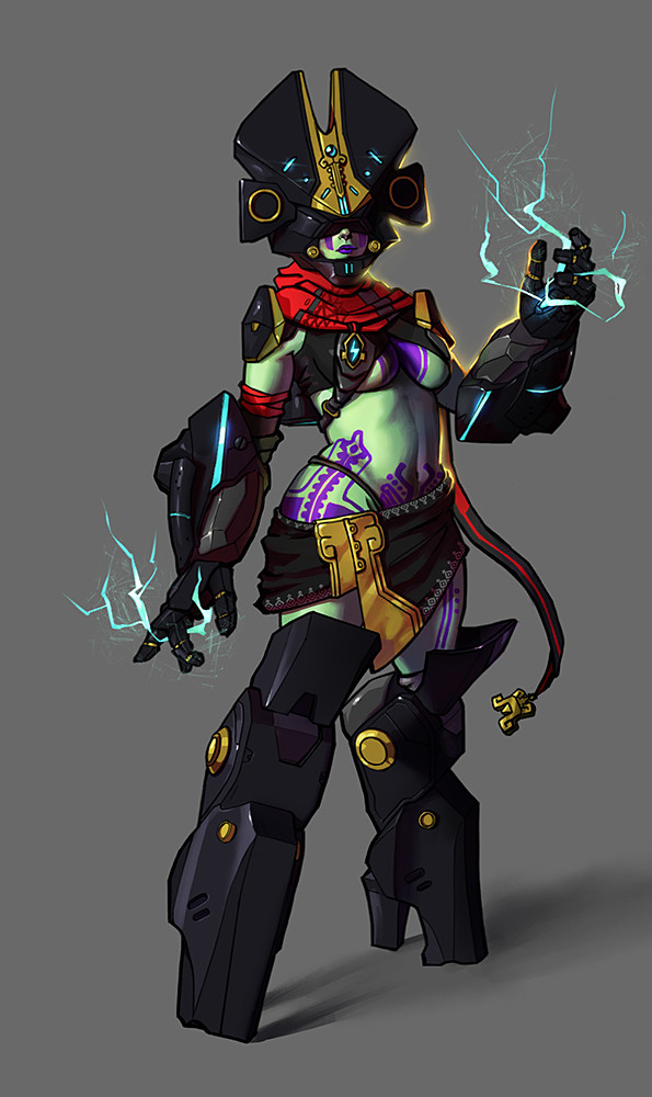
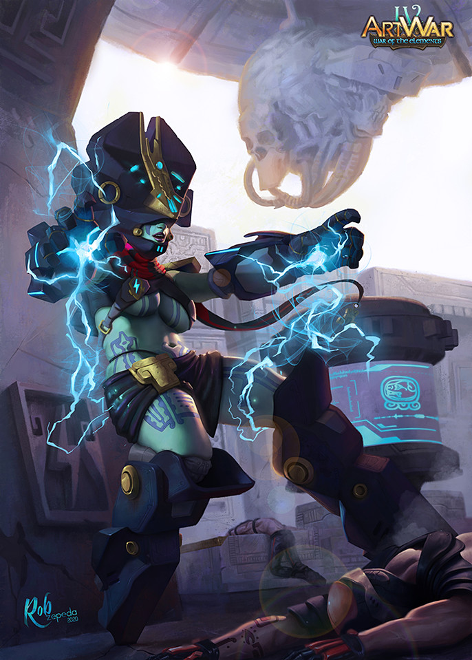
2.9 Finished Painting
The last step was to have all the elements in one layer and apply an adjustment layer with a cool Photo filter overlay.
Finally a lens flare that supports the atmospheric effects of back lighting was added as the top layer.
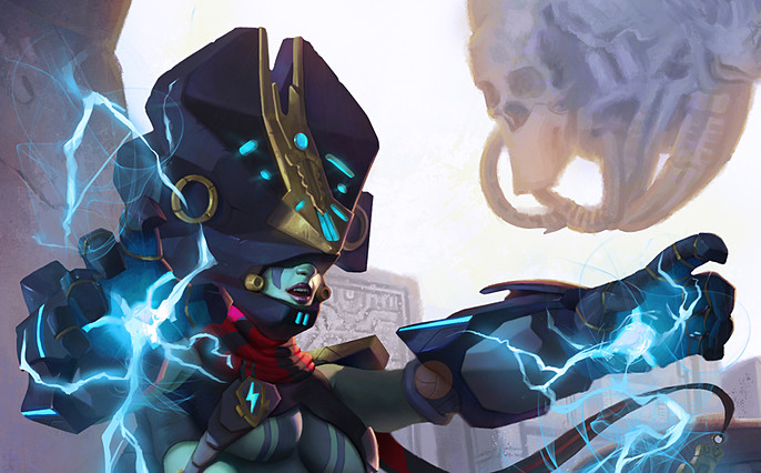
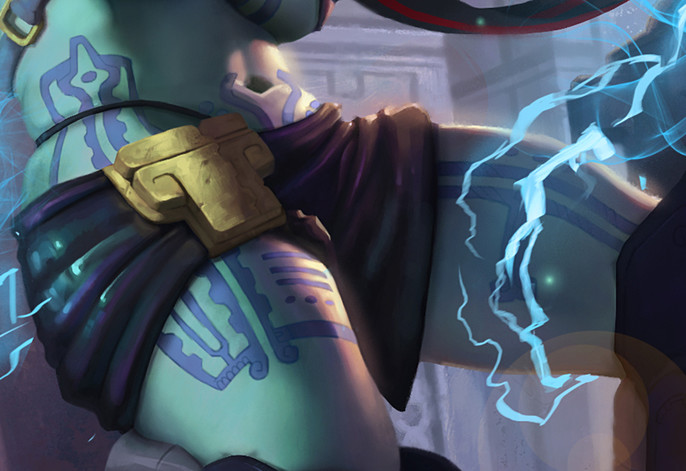
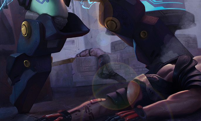
2.10 Fragments of the Finished Piece
Face and hands
Skirt and tattoos
Legs and bad guys
I hope you’ve enjoyed this journey behind the scenes of Keeper of the Thunders.
Please, send me your comments and inquires here.
Thanks for watching.
You can follow Rob here: